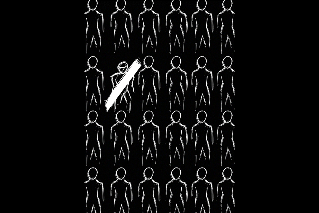
Insight: The way a problem is presented, often leaves any contrary voice silenced and dis-empowered, causing an even stronger, and less challenged bias. In the definition of the problem “inequality”, the virtue of the solution of “equality” is assumed, and “difference” is villainised.
Response: A double booklet – a satirical gender equality manifesto inside, and a neutral outer booklet. The manifesto will begin with events and aspirations of the past, pass through the events and intentions of the present, and project a possible dystopian future should “equality” remain the aspiration, and “difference”, the enemy. The booklet shows that forcing equality in design, causes the dehumanisation of design. Forcing equality on humans, requires the extinction of humanity.
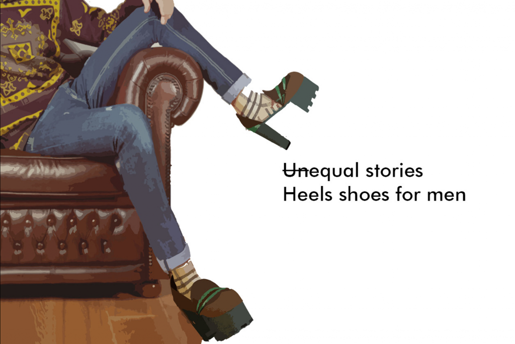
University of Johannesburg: Heel Shoes for Men – Chiara Croci
Insight: The concept came from the story of Ashley, an Australian manager who decided to wear high heels to work. He doesn't wear them to provoke or because he’s homosexual, but because he finds it fascinating how women fill a room with their presence. Ashley likes to feel confident and says that heels help him with that. However, men who want to wear heels have to buy them in the women's department. This provoked the concept: why couldn't I create high-heeled shoes designed for men?
Response: These Heel Shoes for Men were designed by women for men with the aim of fighting the stereotypes both these genders encounter in everyday life. The shoes have been rendered onto various men in different outfits and doing different things in order to provoke the observer. The project aims to shake up a society that tells us how we should behave or what we should wear.
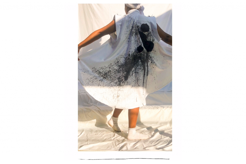
Insight: The fashion industry has been described as a “soft” design field along with interior, textiles and jewellery, and in opposition to architecture, industrial and digital design. To oppose this, I interviewed the designer of local fashion brand, Heart and Heritage and translated her opinions into a garment.
Response: The black and white used in the garment signifies the two sides of the fashion industry. The handmade chiffon roses depict her saying, “there is strength in softness,” while the metal spikes depict the thorns of the roses. The expressive paint splatters embody her saying she, “feels empowered as a female in the fashion design industry.”

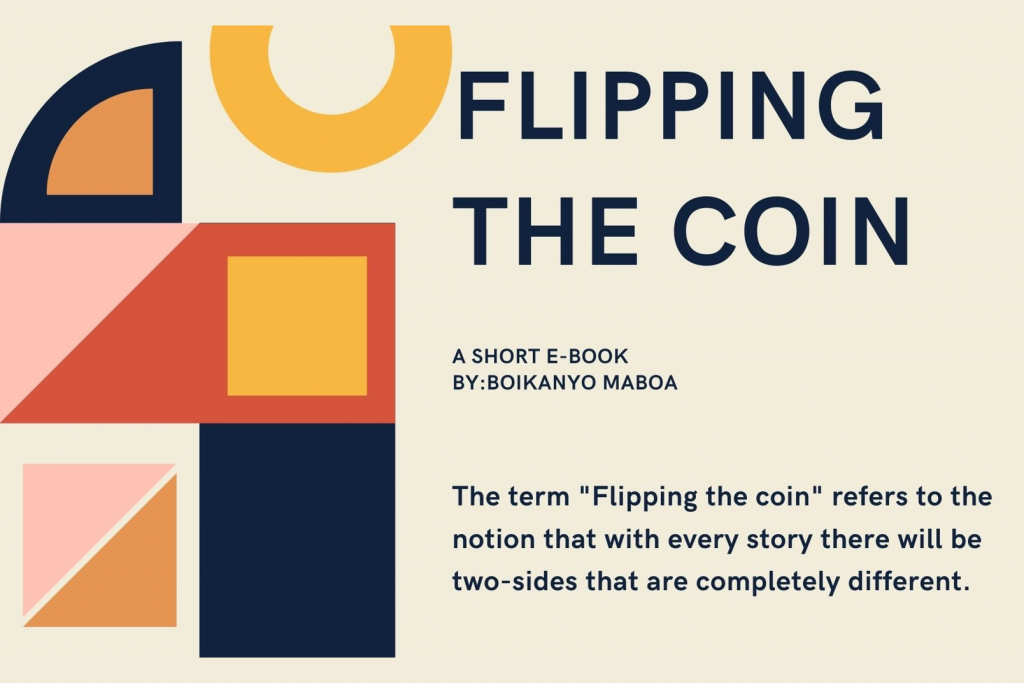
Insight: The project was inspired by an extract from a reading, which indicated that women within the design industry often end up taking a different career path due to the lack of support, mentorship and gender inequalities. Upon graduating, jobs are most likely offered to men due to the consistent employment and cycle of men within the industry. This highlights what is referred to as the leaky pipeline phenomenon, an ideology that underlines the effect of gender bias for women in design.
Response: “Flipping the coin” is an interactive e-book that sheds light on gender intersectionality within four of the most prominent design disciplines: architecture, animation, fashion design and graphic design. The booklet takes on a qualitative research approach, through interviews with sets of young professionals about their respective design fields, their experiences and how they manoeuvre in a male dominated industry. The pair (one male and one female) are asked a single question relating to their design disciplines. Their antithetical answers are what brings together and gets to the root of the problem that causes specific gender inequalities.

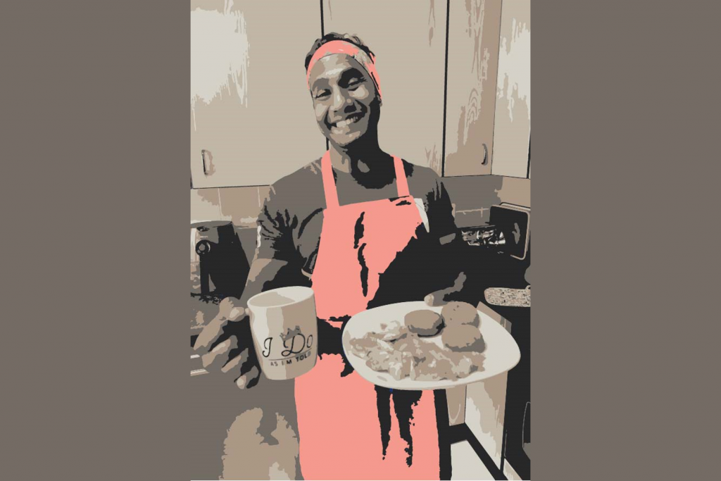
Insight: Through data collection via social media, insight was gathered into the roles of males and females within heterosexual relationships and the day-to-day management of household chores within South Africa. It became increasingly clear that there are several gender disparities within the home environment. Out of 22 total female respondents, 14 carry more than 60% of the workload compared to their male spouses. Of the other 8 respondents, workload is shared fairly, albeit with prompting from the woman, which does not lighten her mental workload. Even in a democratic South Africa, the archaic roles of women in a home have not shifted significantly or fairly. This led to the question, “why was home economics a girl only subject in high school?”. The aim of this project was to flip the dialogue.
Response: “Tips to look after your wife” is a poster, that prompts a shift in the thought processes related to a woman’s role in the home. Considering women have been in this unequal story for generations, would men be comfortable assuming all responsibility at home for a few generations? In a speculative future, this poster would be included in a home economics books, a subject that would be taught to all male students in high school from 2022 onward. In preparation for their future as a husband, this poster would guide them on how to run the perfect home that their wives can be completely relaxed and satisfied within.

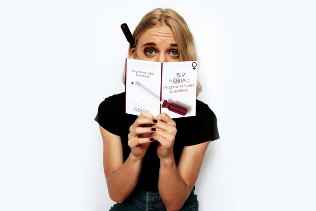
Insight: Through personal experience and interviews, the underestimation of women’s abilities in the design industry was addressed. Given the prominence of mansplaining in the design industry, what if tools/user manuals were designed to highlight some of the ridiculous perceptions of female capabilities? Speculative design is used to communicate how ridiculous these notions are and to start an uncomfortable conversation between men and women about the damage caused by these notions in the design industry. Gender does not denote competence – not even when it comes to tools – and that is the single message of this project.
Response: The MANual mansplains a simple hand tool to a woman. The chosen tool for this user MANual is a screwdriver - phallic in nature and notoriously easy to use, it is well suited to mansplaining. Simple concepts are simplified further, and even the most basic principles behind the screwdriver are explained as though women could not possibly know how to wield one. This is mansplaining shining in the ridiculous, obnoxious, belittling light that is cast on women all over the world of design, embodied in a user manual and a series of contextual photographs. This series embodies the speculative design of a probable future, should we continue this behaviour and have it overflow into other worlds.

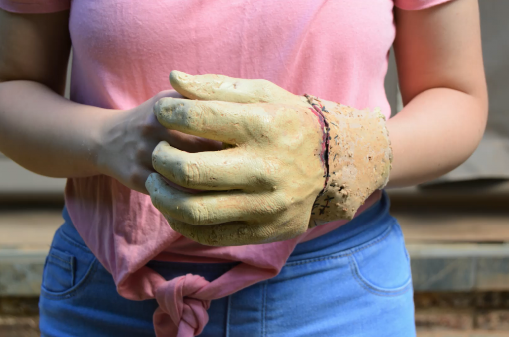
Insight: Through personal experiences, interviews and research, it was discovered that there are major implications for women in the world because of a lack of inclusivity in design, discouraging many women from pursuing certain career paths or doing certain tasks. Women are often made to feel incompetent and blame themselves for being unable to do certain jobs or tasks successfully, when in fact the products designed for that job have not been designed with female considerations in mind.
Response: The “man-hand” speculates a dystopian future where when a girl is born, a male hand is stitched onto theirs. This will allow females to use most of the products in the world with ease because most products are designed for male data. Although these females will be able to use a smartphone with one hand, hold a brick comfortably or use a power tool easily, the stitches, scars and blood remain for life, symbolising the discomfort women have had to endure for years, simply because products were not designed with female considerations. The added piece of skin is a physical and striking mark that emphasises the adjustment women have to make to use products designed around male data. This is a strong visual statement to create awareness of the importance of diversity and inclusivity in design.

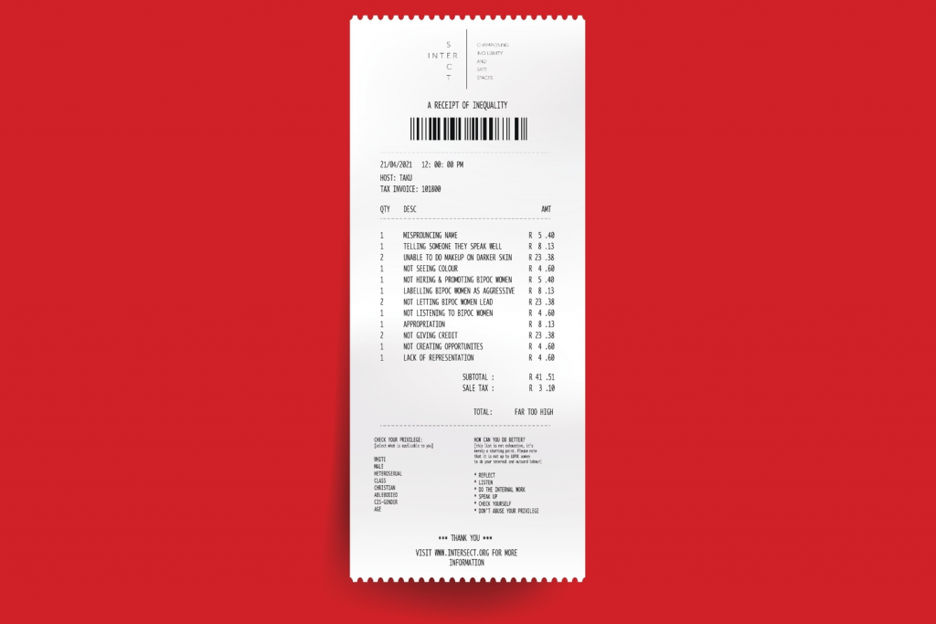
Insight: Through qualitative research and interviews, INTERSECT was born out of the need for a more intersectional approach within fashion design. While we acknowledge that there is a serious issue of gender disparity that affects all women in the field, INTERSECT recognises the BIPOC (Black, Indigenous, People of Colour) women face a multifaceted kind of discrimination and that is why the concept of intersectionality is so integral to the project.
Response: INTERSECT is a campaign that raises awareness about some of the microaggressions that women of colour face in fashion design. Inspiration was drawn from popular culture, specifically from a meme called “show me the receipts” and this culminated into creating a literal receipt of some of the micro-aggressions and overt discrimination that women of colour face within fashion design. INTERSECT prompts people to confront their unconscious bias, and creates a greater conversation and awareness around gender disparity and the importance of intersectionality within design. In addition, we consider how we can start working towards creating safer spaces and championing inclusivity in fashion design spaces.
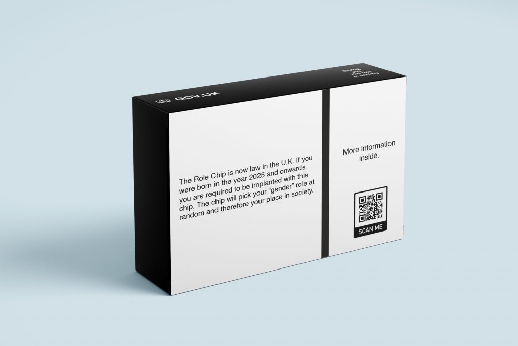
Insight: Judith Butler's seminal text Gender Trouble - Feminism and the Subversion of Identity points to the idea that gender is, to some degree, a performative social construct. In this sense, gender constructions are essentially arbitrary distinctions between individuals that is drawn from heterosexist cultures.
Response: Set in a dystopian future, the UK Government has instituted the use of a 'role chip' which is embedded in the all new-borns at birth. The role chip will automatically and randomly assign the user 1 of 2 'Gender' role's which they will have to abide by. However, there are "anti-chippers" out there planning to revolt...

Insight: Through interviews and research with designers and creative directors, it became increasingly clear that there are a number of glaring disparities within the design industry, specifically Fashion. Just 40% of womenswear brands are actually led by female designers, making it obvious that women are significantly underrepresented within their own industry. Not only are these huge data gaps and inequalities illogical, the clothes produced as a result of them are often just as impractical.
From discussions with women from within and outside of the design industry, the same points were surfaced again and again; women’s clothes are restrictive and often reflect a definitive lack of practical consideration. This gap is observable within every aspect of the industry, from catwalks to office wear. Women’s needs are ignored for the sake of maintaining outdated traditions and preserving appearances that are limiting and uncomfortable.
Response: Impractical is a collection of garments seeking to translate the restrictive nature of women’s clothing to the modern man. Focussed on the blatant inequality within the fashion world, the collection is committed to encouraging a discourse surrounding the lack of female designers within the industry. The result of which is the imposition of limiting and impractical clothing by men, for women. The pieces that make up this outfit are no more illogical than the data gap itself.
Model is 6” 1’ wearing concrete brogues, the 7 foot tie and, the seamless suit trouser.
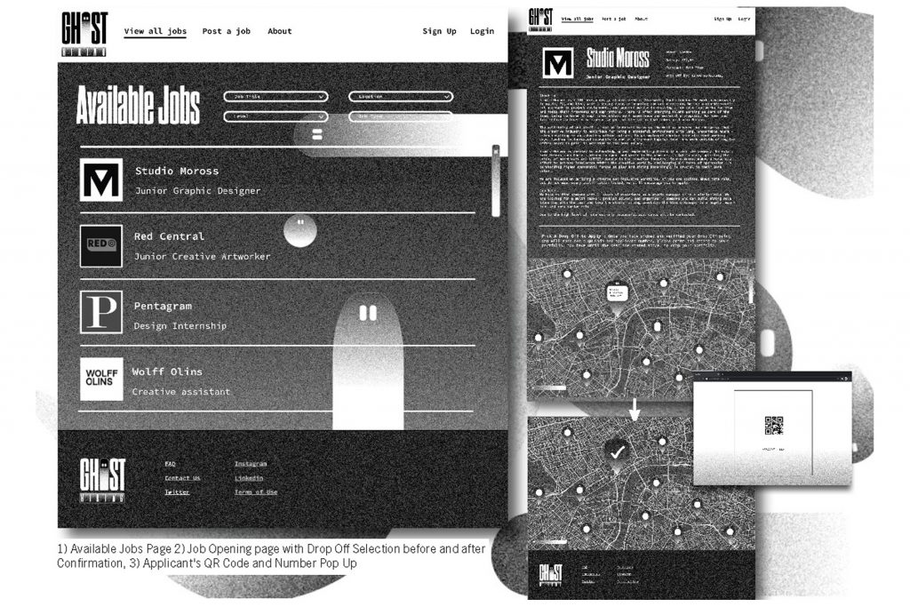
Insight : Based on the statistics found in the Unequal Stories literature, hiring in the design industry is biased towards certain sectors of the population.
Response : Ghost Hiring challenges bias in the design industry through a jobs board that allows young creatives to apply for roles anonymously. Anonymity allows work to be judged on talent alone and erase any preconceptions employer’s may have about the individuals creating the work.
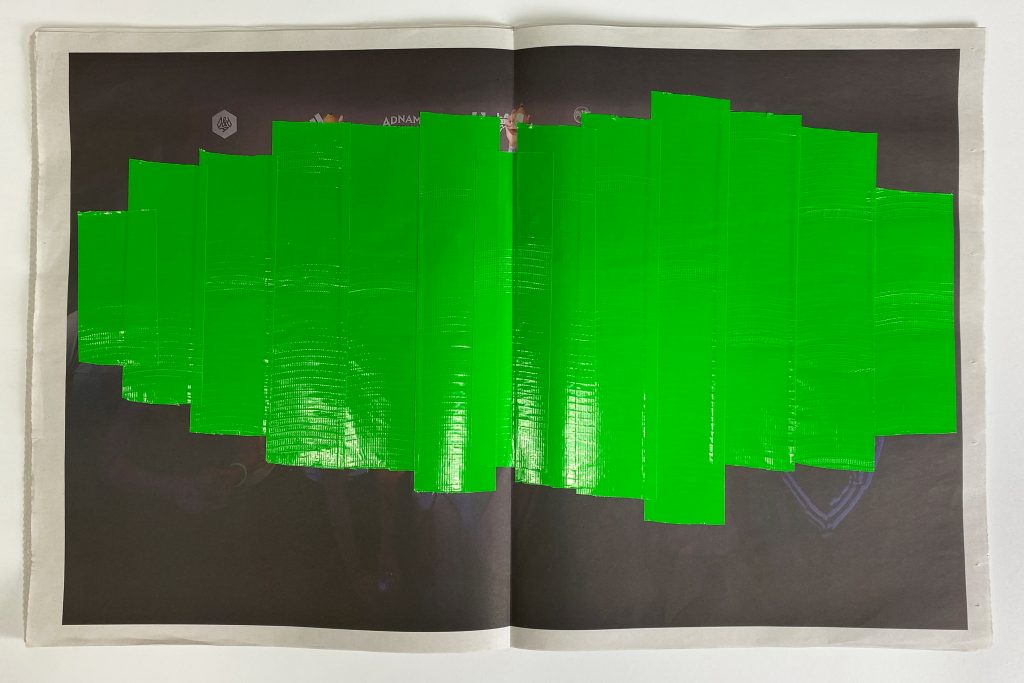
Insight: Historically graphic design has been male dominated and despite recent increases in women attending design school the workforce remains 78% male. Ethnographic research indicated that female designers faced gender specific issues daily but male designers rarely considered gender as an issue, either for themselves or for others. The general consensus was surely good design is good design, no matter the creators gender?
Response: To highlight just how much gender is referenced in print and online (almost always unnecessarily) I’ve created a censor to put the focus back on the work. Designed to be distributed as a guerrilla kit Gender Designer works on posters, books and online without destroying them. The audience is BA/MA students who are ready to educate their peers and university, to get the conversation going on gender imbalance and get male designers aware of the huge gender inequality in design.
